UX Design | Cleveland ClinicComponent Deep Dive - Page Header
Overview
Also shown in my work for our Design System - a deep dive into my workflow behind designing a component and the many ways I ensure a component is responsive, adaptable, and accessible.
My Role
UX Design Lead, UI Design, Use Case Development, Competitive Analysis, Responsive Design, Adaptive Design for Thousands of Different Pages.
Who Was Responsible
I was part of a team consisting of the product owner, front-end developers, content architects, and QA.
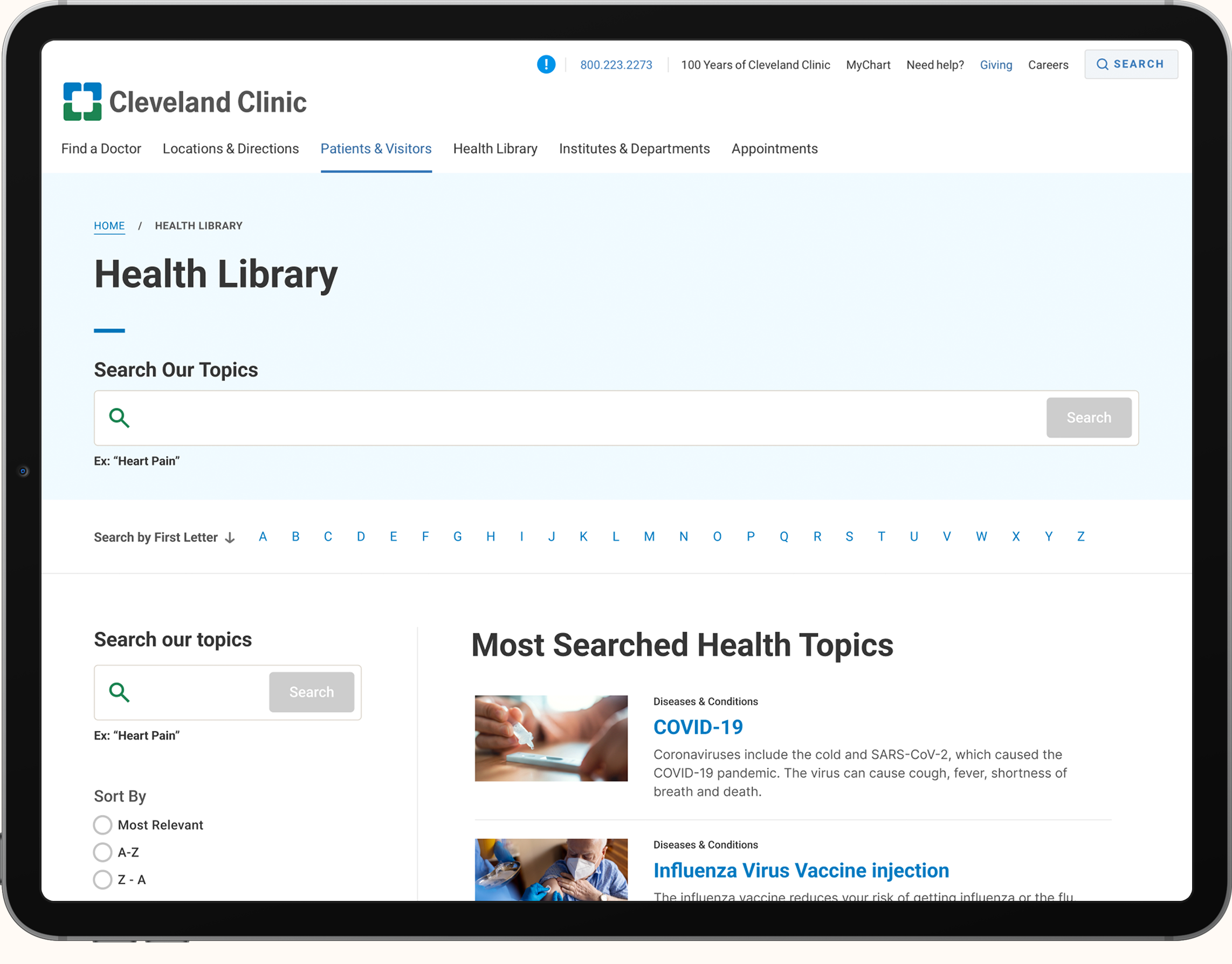
Background
We needed a new page header for our site, with the existing one feeling dated and lacking the design language from our newer components.
Legacy Page Header - used here with extensive breadcrumbs, description, and numerous buttons
Legacy Page Header - used here with a search bar
Example of documentation done for the new Page Header
What needed to be designedElements to Turn On/Off
Breadcrumbs
Leaderboard Ad
H1
Text Blurb
Button Panel
Link List
Search Box
Things I Had to Keep In Mind | The component had to be highly flexible, not just regarding what could be customized with it, but also with stress tests like lengthy paragraphs, long page titles, breadcrumbs that have to wrap multiple lines, etc.
Essentially, it had to be functional over flashy.
Design Process
Competitive Analysis - explored other sites looking for inspiration and functionality use cases. Many sites didn’t have nearly the amount of content options this new header design would need.
Research - explored usability and accessibility best practices with Page Header designs.
Ideation - explored multiple design concepts; the more interesting the design, the easier it was to fail stress tests when you put all the different lengths of the content we might put into its fields.
Final Design - the end result ended up being a mix of what accommodated the most use cases, felt the most on brand, and was the most welcoming to the user when they reached our content. At this stage accessibility concerns are also addressed and documented. Advanced documentation for the Front End Developers is also created with specs, do’s & don’ts, and use cases.
Developer Collaboration - collaborate and give feedback to the developer on how it matches design and any accessibility concerns that may pop up.
Design QA - once the component is finalized by the developer - again examine and inspect it to ensure it matches the design. Weighing minor issues with more pressing issues to not hold up Dev Sprints and future work items.
Final Design

Breadcrumbs
What It Was Designed For | Looking at how crazy complicated our breadcrumbs could get, I knew with the new header a new solution was needed. A large majority of pages have complex, long names due to the fact certain departments and buildings are named after donors and families.
Variations | The top breadcrumb list in the image shows a typical ordering of how they would be displayed. Below that, it shows a new pattern of truncating the breadcrumb if more than five are shown; the list below shows the truncated breadcrumb expanded after clicking on the three dots.
The final breadcrumb shows how it displays on mobile and small tablets - because of mobile’s limited screen space and how crazy long these lists could get, I did research into some best practices, and with those types of criteria, a single breadcrumb that takes you back to the last page you were on was acceptable. The current header didn't even have breadcrumbs on mobile.

Page Header
About | The image shows a few of the variations offered for the page header and a few use cases demonstrating how certain elements flex to accommodate more space. For example, the content block is at a fixed width of 780px on desktop to ensure readability in terms of words per line, but the max width of the H1, breadcrumbs, buttons, and links can extend further - also giving the header a more dynamic visual presence.

Responsive Behavior
Image | The image shows what it looks like across different viewports - Large Tablet, Small Tablet, and Mobile.